With satellite data, new map illustrates how filthy our air is
Yale University team creates interactive map showing variation in polluted air down to the neighbourhood level

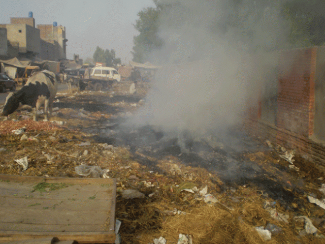
With no proper method in place for disposing trash, burning garbage is a common practice in many parts of Pakistan. PHOTO: SHAHID BUKHARI
Air pollution in Pakistani cities is more hazardous than the notoriously polluted Beijing but they are ranked second to their counterparts in neighbouring India, with New Delhi labeled the most toxic.
A new interactive map created by a team at Yale University puts these World Health Organisation (WHO) rankings into perspective, letting users compare air pollution across countries, cities and even neighbourhoods.
The detailed map, the hard work of Yale’s Angel Hsu and David Wong, uses satellite-derived estimates to measure the presence of fine particulate matter (PM2.5) – air pollutant with 2.5 micrometres diameter or smaller – in the air. These minute particles that are invisible to a naked eye are linked to lung and heart diseases as they can travel into the body and enter bloodstream without detection.
 Pakistan, India and China has world's worst air.
“Unfortunately, many countries do not have ground-based monitoring equipment that are costly, and require maintenance; sometimes issues other than climate change are a higher priority. The lack of a consistent, global network for ground-based PM2.5 monitors means that we have to use alternative data sources, such as satellite data, to fill in gaps,” Hsu tells The Express Tribune.
The Yale researcher says though satellite-data is not ideal as it provides only long-term averages and is measured from space and at the troposphere, it does provide a baseline for understanding and comparison. “How does Pakistan, for example, know where air pollution is the worst within its borders, if it doesn't measure it? How does Karachi’s air compare with New Delhi's? All of these questions can be understood with satellite data, although what is still needed is measurement on the ground, where people live and experience the worst health effects,” Hsu explains.
The high-resolution air pollution data is colour-coded from black, dark red, red to orange and yellow. Areas shaded in black are worst-affected while orange and yellow regions have safe air quality. The higher the amount of PM2.5 in the air, the darker the region appears on the map.
 Scale measuring the level of PM2.5 in the air we breathe.
The WHO believes the measurement of PM2.5 is the best way to gauge the quality of air in a particular area. As many countries do not measure ground based PM2.5, the map is a great tool for comparing quality of air in different parts of the world because it uses satellite data which is a consistent measure for all the countries.
“The data is helpful in comparing air pollution between locations and countries, as it is the same satellite sensors that are registering in every country, globally, regardless of whether a country has ground-based data or not,” Hsu says.
The “Satellite Data” tab on the top of the map reveals the state of air pollution down to the neighbourhood-level. One pixel represents 10-by-10 kilometre of the land; zooming in reveals the problem areas with astonishing details.
 The variation in colour from top to bottom shows how level of pollution differs from one neighbourhood of Karachi to another.
“The data and map can help identify hotspots of air pollution, where the government may need to first prioritise policy interventions and improved ground-based monitoring. But again, I urge that these data are no substitute for ground-based monitoring. The decadal trend of data we show in the map can smooth out short-term, acute air pollution events, like those we often hear about in China such as "airpocalypse",” she stresses.
Given the strong link between carbon emission and power plants, the map pertinently plots world’s dirtiest plants showing the regions that contribute most to the destruction of the global environment.
In 2012, WHO placed the number of global deaths as a result of air pollution exposure at seven million.

Hsu says the map illustrates that all countries are exposed to some level of 'unsafe' air. “The quality tends to be worse where people live - you can see this particularly in parts of eastern China, where the majority of their population lives,” the researcher explains, adding that satellite data shows air quality has gotten worse over the last decade.
“What this means is that we're not doing a good job globally to tackle this critical health issue,” Hsu cautions.


COMMENTS
Comments are moderated and generally will be posted if they are on-topic and not abusive.
For more information, please see our Comments FAQ