Facebook’s redesigned website with dark mode goes live globally
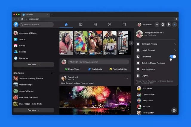
Facebook's new website is faster, easier to use and features Dark Mode

PHOTO: Facebook
“We’ve grown since Facebook.com launched 16 years ago. We’ve built new features, optimised for new devices and operating systems, and expanded to hundreds of languages,” said Facebook.
The new version was only available in some markets but now with the worldwide launch, everyone can access the updated desktop site.
The new site will “now be the web experience for Facebook globally,” adding that “it’s faster, easier to use and gives your eyes a break with dark mode,” says Facebook.
Apple launches new MacBook Pro with updated Magic Keyboard
The updated desktop site also includes a home layout feature with a skinnier News Feed, larger icons and a menu bar that lets you easily jump to various parts of the app.
Here is how you can turn on the new design and enable dark mode:
Click on the down arrow at the end of the upper menu bar to pull up old Facebook’s settings menu.
Click “Switch to new Facebook.”
Click the same down arrow and toggle dark mode from off to on.
The goal when Facebook first unveiled the desktop redesign at its F8 developer conference in 2019 was to revamp the core web experience around the areas most people still enjoy using: events, groups and messaging.
TikTok surpasses 2 billion downloads, records best quarter for any app ever
There is more focus on videos for the News Feed because video ads generate a lot of money for the company and easy access to events and groups alongside a redesigned Messenger panel.
Mark Zuckerberg has shifted gears towards privacy-focused products and features with people spending more time on other social media platforms such as on Instagram, TikTok, Twitch, and YouTube.
The article originally published on The Verge.


COMMENTS
Comments are moderated and generally will be posted if they are on-topic and not abusive.
For more information, please see our Comments FAQ