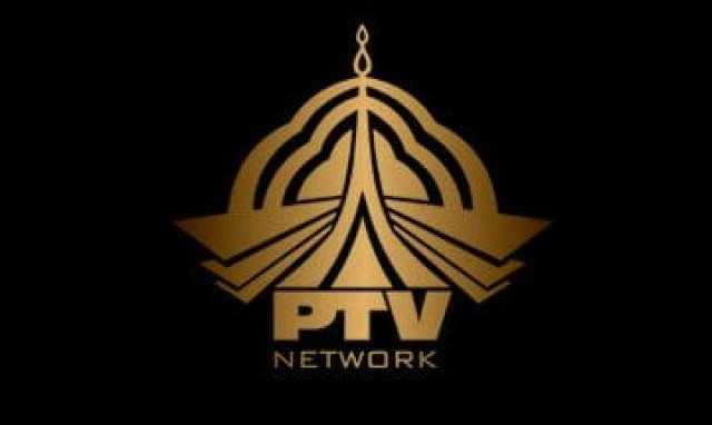
Twitter is pointing out a 'micro' issue with PTV's new logo
Twitter users seem disappointed with the state-run broadcaster’s new logos for its eight different channels
It was recently surfaced that the state-run television corporation has suffered Rs1.12 billion losses within two years with nearly 70 per cent of its expenditure reportedly on human resources. In a recent Senate standing committee meeting, Information and Broadcasting Division Secretary Imran Gardezi lamented about the poor state of affairs at the state-run channel.
PTV running at a loss in PML-N tenure
So when the national broadcaster recently introduced new logos for its eight channels, people on social media immediately began questioning what they were thinking.
Not only was the redesign deemed 'lazy', some also pointed out how it resembled Microsoft Internet Explorer's iconic logo.
Here's how it went down on Twitter:
https://twitter.com/anthonypermal/status/773060197203992576
https://twitter.com/TuahaSohail/status/773066979133497344
Instead of changing Ptv Sports logo again & again, just change the anchor, everything will be fine then.
— Goher Mumtaz (@gohermumtaz) September 1, 2016
Such a poor logo of Ptv sports. World moves towards Mars & & Ptv still potray their past 20 year logo.
— Aleem Tayyab (@aleemtayyab91) August 30, 2016
https://twitter.com/Rizwvan/status/770622465445953536
PTV Sports New Logo is so Old Fashioned Just like Pakistan Cricket Team #NewLogo #NoCreativity
— MahwishSolanki مہوش (@mahwishSulanki) August 30, 2016
https://twitter.com/ma_arain/status/770319270379130881
Every Six months Ptv change their Logo only government channel can do this strange strategy back now. it's pack to 90s type ptv logo 😕
— Y A S I R (@Yasirhere) August 29, 2016
Have something to add to the story? Share it in the comments below.







COMMENTS
Comments are moderated and generally will be posted if they are on-topic and not abusive.
For more information, please see our Comments FAQ