Yes, the new MacBook Pro is underwhelming. No, I’m not switching to a Surface Studio
Most seem to think the Surface Studio is going to pull creatives away from Apple’s market share
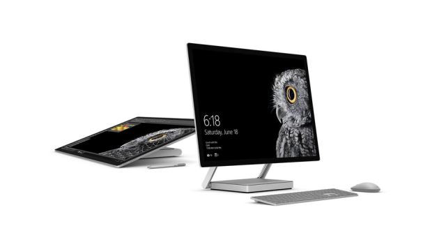
Microsoft's newly announced Surface Studio all-in-one Windows 10 PC. PHOTO: MICROSOFT
But something strange has been happening, especially since Microsoft launched a slew of new products (most notably the Surface Studio) just days before Apple’s event.
Everyone’s calling out Apple’s demise. That includes some authors on CNET, Mashable, Wired, and even here in Tech in Asia.
Microsoft takes on Apple with the new Surface Studio
Most seem to have the idea that the Surface Studio is going to pull creatives away from Apple’s market share and into Window’s ecosystem, but I highly doubt that is going to happen in the near future. Why? Because, well, the Surface Studio runs on Windows.
I’m not talking about how Apple’s tight ecosystem keeps me from switching away from my MacBook Pro and iPhone. I’m talking about how Windows is just an OS that’s badly designed and ill-suited for creatives. Here’s what I mean.
It’s 2016 and Windows 10 still doesn’t properly support hi-DPI screens
Hi-DPI (aka high-resolution density) screens are commonplace today. In fact, it was already popular in 2015.
And yet when Windows 10 first launched, it had poor support for these. For high-density, high-resolution screens (like the Retina MacBook Pro or the Dell XPS 13), text appeared minuscule on most apps, if not pixellated and blurry.
Look at how Windows 10 handled hi-DPI screens vs. how OS X did it:
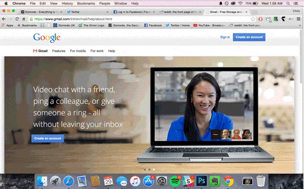 PHOTO: GIZMODO
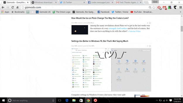 PHOTO: GIZMODO
Google Chrome on Windows 10 had giant tabs and regular-sized text (if not regular-sized tabs and minuscule text) while Google Chrome on OS X appeared fine on Retina.
It’s worse when you’re working with a mix of hi-DPI and low-DPI screens like I do. When you drag a window from one screen to the other, it undergoes a grotesque transformation and either blows up or shrinks. There were times when transferring the window caused it to expand to a size larger than the screen. This renders it quite unusable and incredibly annoying.
Microsoft announces "creators update" for Windows 10
In an anniversary update to Windows 10, released a couple of months ago, Microsoft attempted to fix the issue. However, the problems remain. According to tech writer Paul Thurrott, Microsoft may never fix the hi-DPI problem in Windows 10.
Lots of creatives (including myself) use multiple screens. And chances are, the screens are going to have different pixel densities. Until Microsoft makes its OS operate smoothly at differently scaled screens like Apple does, I’m never going to seriously consider switching to a Windows device.
Windows 10 is a mess of visual inconsistencies
Windows 10 looks like it’s been created by a bunch of graphic designers with no coordination between departments, who are all pulling late nights to make the deadline and then failed and decided to just ship it anyway.
Icons for the same functions appear different in varied contexts. Contextual menus and even scrollbars are inconsistent.
Heck, there are even two control panel interfaces:
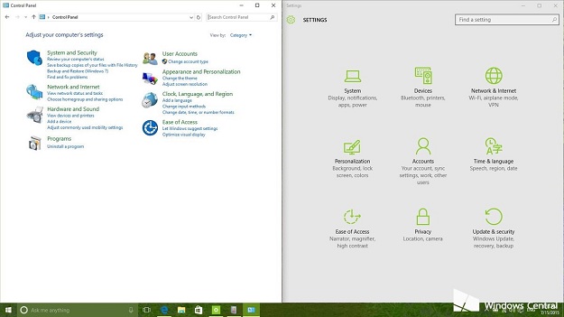 PHOTO: WINDOWCENTRAL.COM
This is highly annoying and distracting not only to me but to anyone who cares about visual consistency (oh right, that’s the entire creative market).
Just look at how many different context menu styles Windows 10 sports:
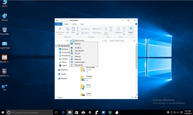 PHOTO: REDDITOR PULAGATHA
Need more examples? Here’s a Reddit thread with a list of some of the visual inconsistencies in Windows 10. These visual inconsistencies might not matter to the majority of Windows users, but they matter a lot to anyone in the creative field. After all, you wouldn’t feel inspired to create beautiful designs on an OS that’s not beautifully designed (or even consistent), would you?
It’s the tiny details that matter
Like how the top bar of a window is designed like this:
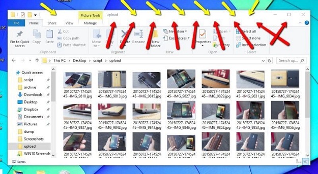 PHOTO: GIZMODO
But you can only drag it if you grab it at the topmost part of the bar. Grabbing the window anywhere the red arrows point won’t allow you to drag it even though it looks visually indistinguishable from the “grabbable” area.
Or how the settings menus across different native apps look different:
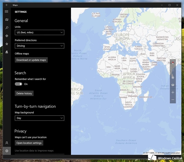 PHOTO: WINDOWCENTRAL.COM
 PHOTO: WINDOWCENTRAL.COM
Apple, on the other hand, excels at making the tiny details work. It’s the reason why, despite having bugs and issues in its OS, it still has one of the highest customer satisfaction ratings. It’s why it just works (most of the time).
Conclusion
So yes, Apple’s MacBook event has been disappointing and underwhelming. Users of MacBooks are going to lament the removal of HDMI, USB, and SD card ports and some might start to feel left out. But my guess is that creatives aren’t going to start seriously considering Windows, because…Windows.
The Surface Studio is a splashy new device with an intriguing form factor, but it’s not enough. Hardware is only part of the equation. As long as it runs on Windows, and as long as Windows remains the same (which is very likely), I doubt it will sway many creatives to make the switch.
This article originally appeared on Tech in Asia.




COMMENTS
Comments are moderated and generally will be posted if they are on-topic and not abusive.
For more information, please see our Comments FAQ