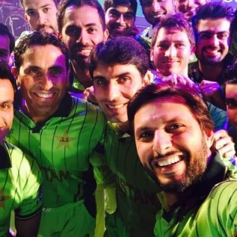
The new kit has a light green color and the crescent and star of the previous World Cup kit (2011) has been removed and straight dark green lines can be seen on the front and the back.

The new kit has a PCB logo on the left upper side while the ICC cricket World Cup 2015 logo is placed on the right upper side.
The kit has 'Pakistan' written on it in golden color with a black outline while on the back the same pattern is being followed for the name and number of the cricketers.
Here it is the #Lala'sSelfie RT as much as we can, so the joy of #WC2015 at #BoomBoom style begin. @SAfridiOfficial pic.twitter.com/XVoI2KBAdw
— جاوید آفریدی (@JAfridi10) January 14, 2015
Like Sports on Facebook, follow @ETribuneSports on Twitter to stay informed and join in the conversation.
COMMENTS (18)
Comments are moderated and generally will be posted if they are on-topic and not abusive.
For more information, please see our Comments FAQ
strong textLooks like JAIL uniform.
pakistan planning to intimidate opposition teams with those shiny colors,if that is the case pakistan is winning, i thought our's was the worst.
they will be beaten anyway why spend paisa?
how soon will the replicas be available in Pak? I live in Aus, here 92 WC replicas are sold for $60. ouch..would be good ti get the new one from Pak instead.
REALLY MISSED SAEED AJMAL
I know the sentiment of the fans is with the light pistachio creamy green color as the team has really done well in 92 and 99 when the colors where light. But honestly, If you start choosing colors of your kit based on superstitution, than rather just go on a religious pilgrimage than playing a world cup.
Logically, it doesn't make too much sense. National color of Pakistan as shown on its flag is dark green, not light. Further, all cricket Pakistan has played since the last world cup in 2011 has been in dark green kits (which really look cool). So i would say, superstitution and sentiment prevailed over logic which is a bit disappointing.
Also, I dont understand the reason behind having vertical lines on the shirt. What are they signifying? They are making the jersey look really clumsy and old fashioned.
They can wear pink for all I care. Whats important is their performance on the field.
this z not a good design neither good colour...seems no thought process has been used in designing the uniform.the colour n the design should depict smthing wch increases the moral of the players on the feild,like we c in foot ball,every team has a jersey wch depicts the national flag,but alas .........We don't Hv such imagination.
this z not a good design neither good colour...seems no thought process has been used in designing the uniform.the colour n the design should depict smthing wch increases the moral of the players on the feild,like we c in foot ball,every team has a jersey wch depicts the national flag,but alas .........
The lines are vertical, not "straight horizontal". Maybe the tribune should hire me instead :P
nice look for all team
Nice!
Atleast these are better than what is being said the official kits on the ICC web site.
Nooooo! The current kit is much better. Should have been a darker shade of green.
The reporter has his left and right messed up. PCB logo is on the left and WC logo on the right.
great choice, light green kit is lucky for Pak, they had similar kit in 92' and 99' world cups.
please give a chance to the legend magician ajmal