Looking for ‘Eckma’, the shadow fighting superhero? Check out the IVS 2011 thesis
The fine art thesis is always the display that excites me most.
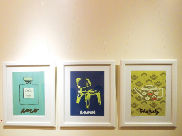
Usually, thesis displays by this department mostly employ the use of photography, but this time around, it seemed that hand-done illustrations and rendering were the way to go. Qat, an original typeface created by Marium Usman, took well known media ideals as inspiration for each letter (M for Mahira, V inspired by Vaneeza) and offered a wall display of the entire alphabet as well as framed pieces using the letters to advertise the personalities they were derived from. The entire presentation was impeccably handled, cleanly arranged and easily communicated to the viewer. Another display conducted within a small studio space used accompanying audio narratives, light projection and earthy prints depicting the mental environment of a paranoid individual and her obsessive thoughts. Upon first glance, the work did not strike one as a Communication Design piece, although its creator explained how she had worked both with prints and digital media. It was more of an experience, she felt, than a display of work.
In complete contrast to the mood created by this portrayal was Aamir Riffat’s ‘Eckma’, a Karachi based character who fights shadows to protect the city of lights. Riffat’s promo for the video game was simply brilliant, with his illustrations, audio accompaniment and animation all falling into perfect synch. His display consisted of life-sized cutouts of the anime-inspired ‘Eckma’ and a screen playing clips from the promo, attracting students and visitors alike. Another interesting piece of work, ‘The unbearable likeness of being Osama’ showed a darkly humorous view of a boy with the same name as the supposed father of terrorists. Written in rhyme and inspired by the limerick, the book contained illustrations and a bluntly funny account of how it felt to be perceived differently simply because of a namesake. Although the style was minimal and clean, the writing was spot-on and conveyed perfectly the quirky grievances of the designer. ‘Humsafar’, a board game based on the map of Pakistan, was another fantastic display of work, where the designer had paid painstaking attention to every detail including the playing cards, dice and counters. Using full-colour illustrations, the board game is a mix of travel and trivia and offers the player an all-rounded experience of fun aesthetics.
Other work includes graphic novels, illustrated diaries, solutions for digital interactivity and public-service messages shown through a series of hilarious videos. The overall presentation was fun, colourful and modern without losing the very important human element that adds a distinctive flavor to the style of each student’s work. Running till December 10, the thesis of 2011 was a definite success and reflects the immaculate balance of creative thought taken to the next step with digital assistance.
The writer is a communication design student at IVSAA
Published in The Express Tribune, December 5th, 2011.








COMMENTS
Comments are moderated and generally will be posted if they are on-topic and not abusive.
For more information, please see our Comments FAQ