Windows 11 Paint re-design review
A re-designed Paint was launched this month with the Windows 11 update, creating a refreshed look of the classic app

Microsoft has again updated and redesigned its classic Paint app, after its last rebranding in 2017 Windows 10 update. Paint 3D has been replaced with classic Paint with new UI features, and interface.
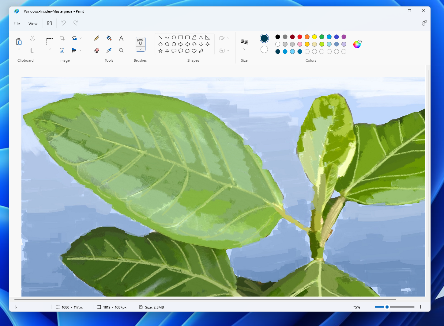
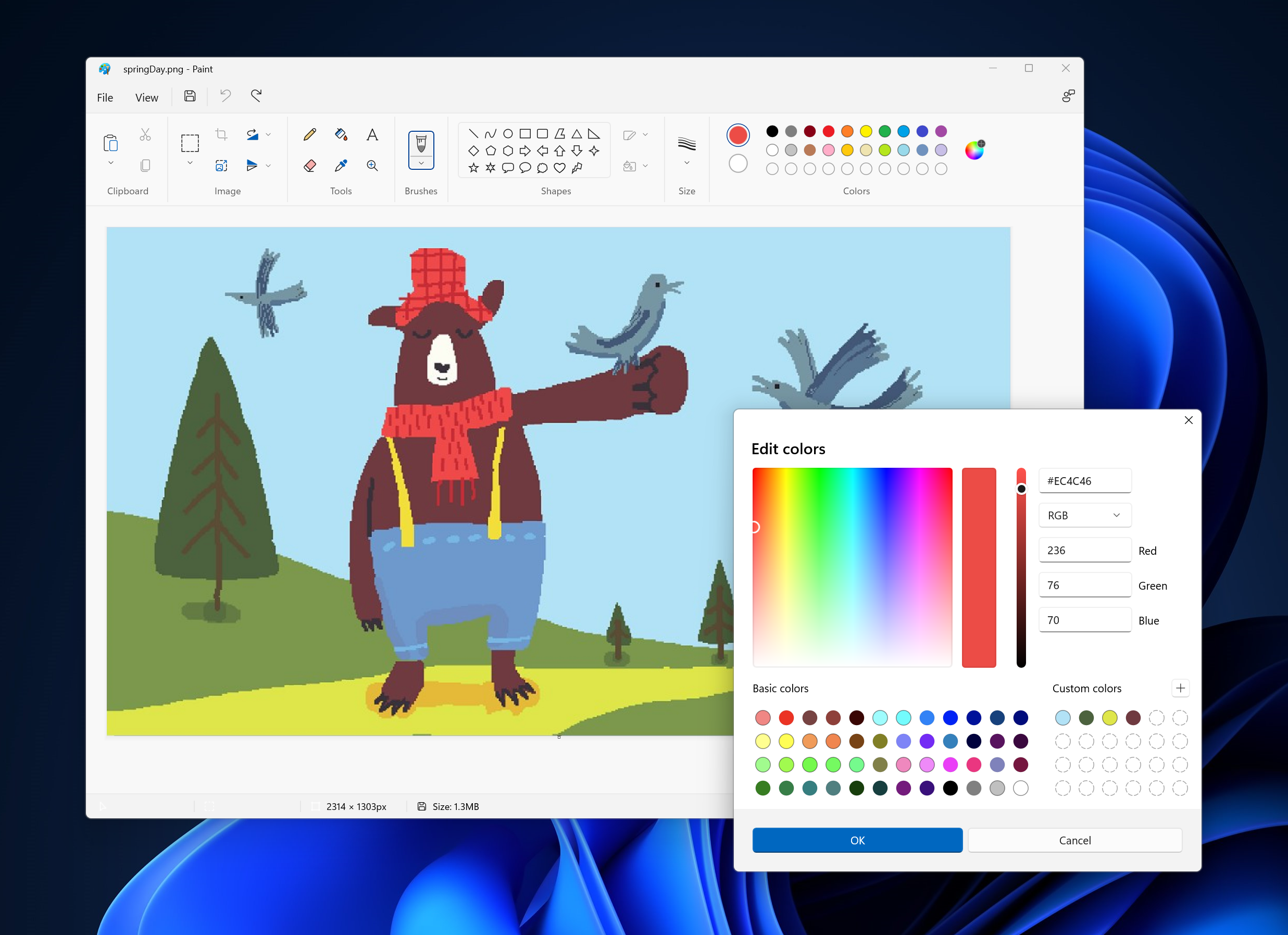
Paint has now a redesigned look, with new icons that give a minimalist outlook, based on "simple and geometric forms," while using "modern metaphors that are easily understood." Microsoft has also added new fonts to the collection including Segoe Fluent Icons, which "complements Windows 11's geometry," and refers to "the shape, size and position of UI elements, with Windows 11 featuring "progressively rounded corners, nested elements, and consistent gutters."

Removing all text from the ribbon, Windows 11 design has just seven words when expanded, compared to the previous 20-word ribbon from Windows 10. The design is difficult to navigate and get used to, as users may need to invest time re-discovering where tools lie.
Much of the tooltips don't offer as much detail as they used to before, like the "Resize and skew the picture or selection" tool in Windows 10 offered full detail, but in the recent version only explains the tool as "Resize." Brush sizes are also labelled instead of making users guess the size they wish to use with a small icon.

While there is a zoom plus and minus option, with draggable controls, the menu displays a 100 percent option. Critics are calling the new menu quite an arduous hassle, requiring them to click more times than previously required, to access different options, as the menu closes after each click.
Microsoft principal program manager Dave Grochocki says that future updates of Paint will include a "dark theme, a centered canvas, and updated dialogs."
While the new design does make Paint look much better, its ease in usability has reclined with the new changes made. Many have also complained of a stutter while launching the program, which takes a second for all of the interface to load, making it quite jarring for some.


COMMENTS
Comments are moderated and generally will be posted if they are on-topic and not abusive.
For more information, please see our Comments FAQ