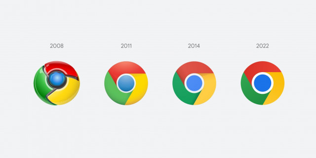
Google Chrome is changing its logo for the first time in eight years
Google has also created ‘OS-specific customizations’

Chrome is changing its logo design for the first time in eight years. The difference is hard to tell, because the changes are quite subtle.
Elvin Hu, designer for Google Chrome, shared the information on Twitter and initial look at the redesign in progress. According to Hu, Google has simplified the main icon by ‘removing shadows, refining proportions and brightening colours.’
Fun fact: we also found that placing certain shades of green and red next to each other created an unpleasant color vibration, so we introduced a very subtle gradient to the main icon to mitigate that, making the icon more accessible. pic.twitter.com/H26wQKRhp9
— Elvin 🌈 (@elvin_not_11) February 4, 2022
If you squint hard, you may notice that the colours are more vibrant and the circle in the center seems bigger.
“We simplified the main brand icon by removing the shadows, refining the proportions and brightening the colors, to align with Google's more modern brand expression,” Hu tweeted.
“Fun fact: we also found that placing certain shades of green and red next to each other created an unpleasant color vibration, so we introduced a very subtle gradient to the main icon to mitigate that, making the icon more accessible.”
Google has also created ‘OS-specific customizations’ according to Hu, who explained that Google wants the icons to ‘feel recognizably Chrome, but also well crafted for each OS. For example, on Windows, the icons take on an obviously gradated look, appearing at home on Windows 10 & 11’.
Answering the question probably on your mind; “why bother with sth. so subtle?”, Hu said: "We tailor Chrome’s experience to each OS, with features like Native Window Occlusion on Windows, day-one M1 support on macOS, Widgets on iOS/Android, and Material You on Android. We want our brand to convey the same level of care."


COMMENTS
Comments are moderated and generally will be posted if they are on-topic and not abusive.
For more information, please see our Comments FAQ