Pantone crowns Very Peri, a vibrant blue-purple, as Colour of the Year for 2022
‘Warmest and happiest of all blue hues, Very Peri brings a vision to rewrite lives post pandemic’ says Pantone

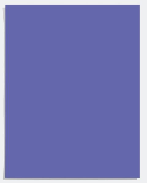
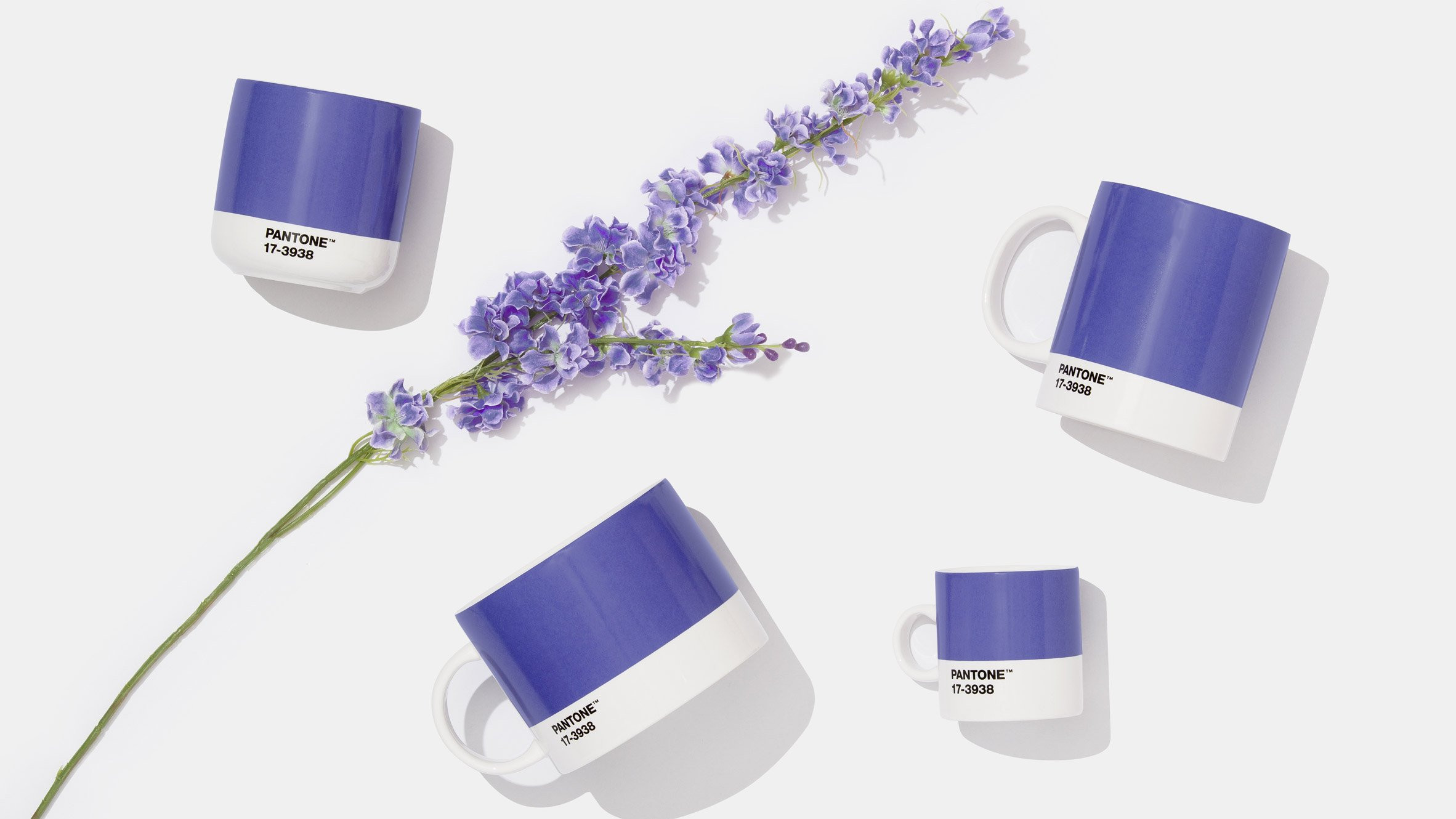
For the first time in the history of Colour of the Year forecasts, Pantone created its own brand new colour and crowned the shade the ‘It’ colour of 2022. Very Peri is a rich blend of purple and blue hues, with hints of lilac, lavender, and the colour of clear blue skies, carrying a sense of comfort with it. It was created to reform perspectives that dominated the lives of people in a Covid world.
"We are living in transformative times," says Leatrice Eiseman, Executive Director, Pantone Color Institute. "PANTONE 17-3938 (Very Peri) is a symbol of the global zeitgeist of the moment and the transition we are going through. As we emerge from an intense period of isolation, our notions and standards are changing, and our physical and digital lives have merged in new ways."
"The colour symbolizes the future," Eiseman adds. "(It) has that sprightly, joyous attitude that we're talking about, that carefree confidence, and creative spirit."
Pantone describes its own creation as a "dynamic periwinkle blue hue with a vivifying violet-red undertone." With colours affecting emotions in a variety of ways depending on their hues, Pantone seized the creative opportunity to create an impactful colour, saying that Very Peri “blends the faithfulness and constancy of blue with the energy and excitement of red."
According to Pantone, Very Peri holds the happiest and warmest of all the blue hues, which helps in embracing new possibilities and opening up to new ways of seeing as people's lives are rewritten in a Covid-ravaged world.
For 23 years, the annual tradition of Pantone’s Colour of the Year has proven to influence multiple industries including, but not limited to, fashion, architecture, interior and industrial design, product packaging and even graphic design. It prompts artists to experiment with the colour, offering newer perspectives and setting the stage for displays of creative expression and imagination.
For offices and homes, Very Peri will inject playfulness into the interior, enlivening spaces with purple-blue tones. A great pop of colour to add in even the most pared-back living spaces, this versatile shade is suited to different materials, textures and finishes. It can be introduced into the space through a painted wall, furniture or home accessories.
Here’s to a year of vibrant purple-blue hues around us!
Have something to add to the story? Share it in the comments below.
LATEST

Sky-high prices steal the spotlight from Eid 2026 collections

First joint Pak-China fashion show takes place at Great Wall

Hermes designer Veronique Nichanian to depart after 37 years

Hussain Rehar shines at Paris Fashion Week

Victoria Beckham parades youthful collection at Paris Fashion Week

Doja Cat completes her listening party look with Pakistani brand Warp’s handbag
MOST READ

PM Shehbaz requests Trump and Iran for 2-week ceasefire, Hormuz reopening to advance Middle East peace efforts

Pakistan's repayment of UAE deposits signals improving external stability: analysts

IMF sets NAB chief terms

Shopping malls, markets to close at 8pm nationwide except Sindh amid fuel crisis

Rawalpindi enforces Section 144 ahead of PTI protest


COMMENTS
Comments are moderated and generally will be posted if they are on-topic and not abusive.
For more information, please see our Comments FAQ