7 colours you shouldn’t have in your house
Although the ‘perfect colour’ is highly subjective, there are a certain don’ts that should be kept in mind

Picking the perfect colour for your humble abode could be the most challenging part of home decor. The stakes are high since an unpleasant shade could easily diminish the economic value of your real estate.
Although the ‘perfect colour’ is highly subjective, there are a certain don’ts that we don’t always know about. As compiled from Reader’s Digest, here is a list of seven colours and colour combinations that you should avoid painting your house.
- Red and yellow
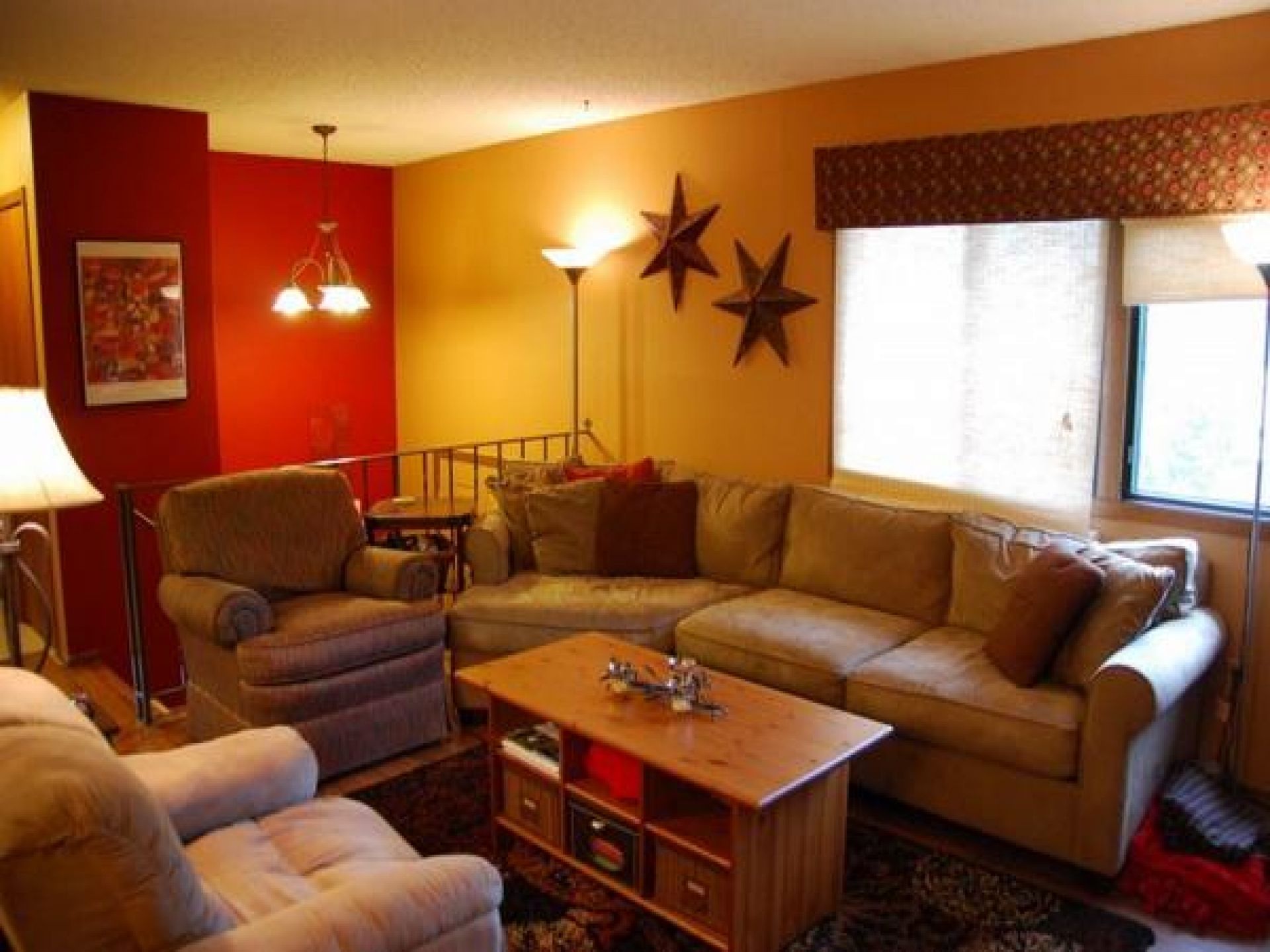
There are two colours that should never be used on interior walls: Red and yellow. You should stick to warmer, neutral tones such as greys and blues. These projects will actually hurt your home’s resale value.
- Warm white
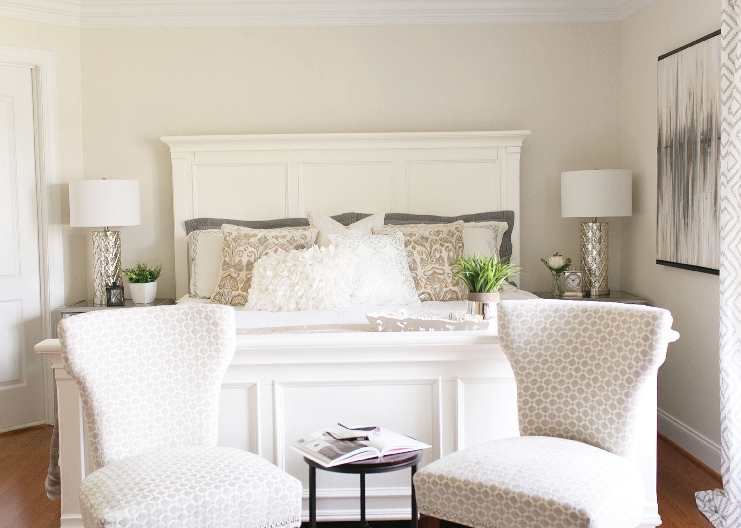
Any white with a warm undertone can look dingy, especially in the wrong light.
- Builder’s beige
The neutrals that can help sell a home can also give off a dirty cast. If you want a nice neutral, consider something that toes the line between taupe and gray.
- Green
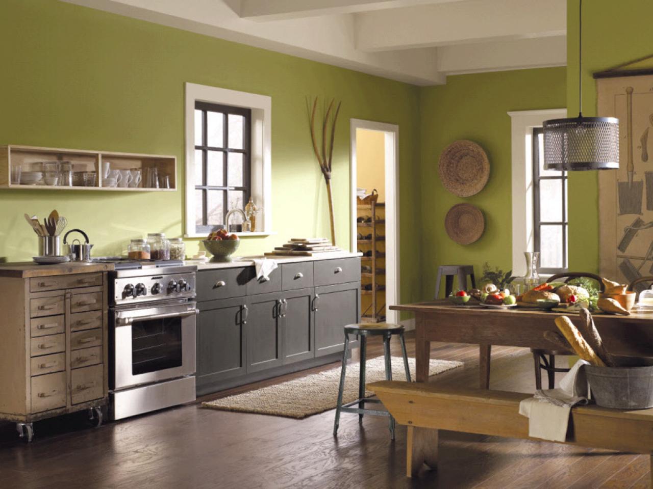
Pale greens can sometimes feel like sickrooms or cast a pallor upon your favourite faces. Instead of worrying about the relative minty-ness or sage-like qualities of light greens, consider cashing in on one of the latest trends, which looks flattering in both modern and historic homes: hunter green.
- Pink
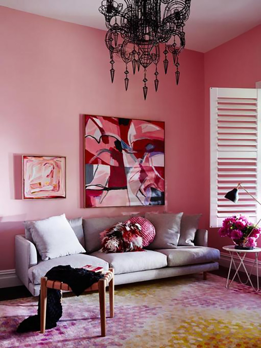
Pink can be a struggle. Too light and it feels sickly-sweet. Too muddy and its dirty. But the current pink trend has turned into using pink as a neutral, so choosing the right one may be in your future.
- Blue
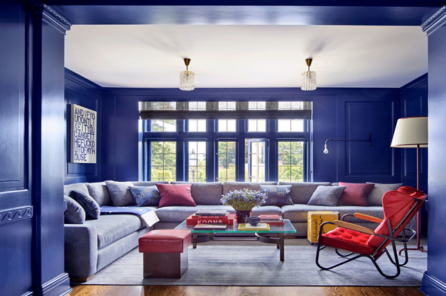
A study by Appetite found that people ate more snack foods and drank more soft drinks that were in blue packaging so that could extend into the kitchen if you decided to use that colour.
- Copper red
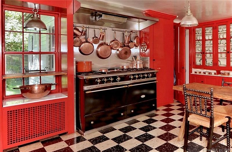
Zillow came out with a paint analysis that took a look at the best colours for different parts of a house and found that kitchens should not be painted brick red, terracotta, or copper-red. Try a white instead. Again, most people start their days in the kitchen, white will surely energise the room.
Have something to add to the story? Share in the comments below.
LATEST

Rajab Butt unveils first teaser for latest music video My Side with Abdullah Khan

Over 1,000 artists call for boycott of Eurovision over Israel's participation

'Bridgerton' star Simone Ashley steps into music with debut EP 'Songs I Wrote in New York'

Sajal, Wahaj's web series 'The Pink Shirt' drops trailer ahead of its April 24 premiere

Lahore's Alhamra Arts Council to hold first 'Kathak Festival' in tribute to Maharaj Ghulam Hussain

Rising actor, model Ali Dayyan Walji ties the knot
MOST READ

Govt moves to end used car influx

Gold, silver prices drop across global and local markets

Sindh expands free Pink Scooty scheme to Hyderabad

IMF loads $7 billion package with 11 new conditions for govt

New Iran deal 'far better' than Obama nuclear deal, coming 'relatively quickly': Trump


COMMENTS
Comments are moderated and generally will be posted if they are on-topic and not abusive.
For more information, please see our Comments FAQ