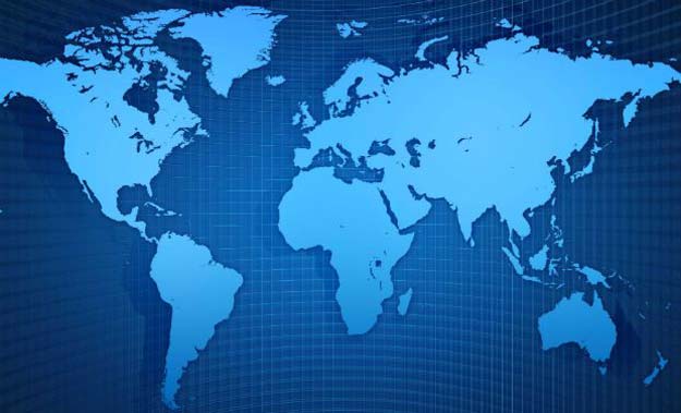
A map made by Europe for Europe, it distorts the relative size of countries to the advantage of the West. While Africa appears much smaller than it really is, Canada, Russia, the United States and Europe are greatly enlarged in the map. And the distortion is largest near the poles. For example, Greenland, which looks about the same size as the whole of Africa on the Mercator, is in reality, no bigger than the Democratic Republic of Congo.
Google Maps shows Azad Kashmir as Indian territory in latest gaffe
It all began in the 16th century when the European cartographer Geert de Kremer, better known as Mercator, charted the world. "Somehow this map projection came to be used on most world maps, especially those produced for classrooms since the beginning of the 1900s," says Menno-Jan Kraak, president of the International Cartographic Association and professor of cartography at the University of Twente, Netherlands. "Most of us have grown up with this world image."
The 1569 Mercator projection was made for navigating the seas -- drawing the meridians and parallels as straight lines that cross at right angles helped sailors to navigate some of their first treacherous voyages around the world. The map has been used as a political tool and for propaganda. It can make enlarged countries seem unnaturally powerful and intimidating. "The term power of representation and representation of power sums up quite well how maps and the rise of the Western nation-state system -- and with that, empire and colonialism -- are linked," says Marianne Franklin, professor of Global Media and Politics at Goldsmiths, University of London.
Google explains why Palestine isn't labeled on Maps
The Mercator map may even have spurred on European imperialism. "The world maps that prevail today have been embedded in Western imaginations since the British empire. They continue (to prevail) despite many challenges to their fairness and accuracy because they underpin the ongoing Anglo-Euro-American presumption that the world belongs to them, and pivots around these geo-cultural axes," Franklin says.
Since the Earth is a sphere, there is no perfect map as it is impossible to chart it on a flat surface without errors in proportion. Germany and the US have started to replace the Mercator maps based on the so-called Winkel Tripel projection. However, the former still remains the most widely used in the world.
The digital revolution has further strengthened the Mercator's dominance. Today the Mercator projection is being used as a template at Google Maps, OpenStreetMap and Bing, says Kraak.
This article originally appeared on CNN


COMMENTS (4)
Comments are moderated and generally will be posted if they are on-topic and not abusive.
For more information, please see our Comments FAQ